PANTRY - YOUR RECIPE APP
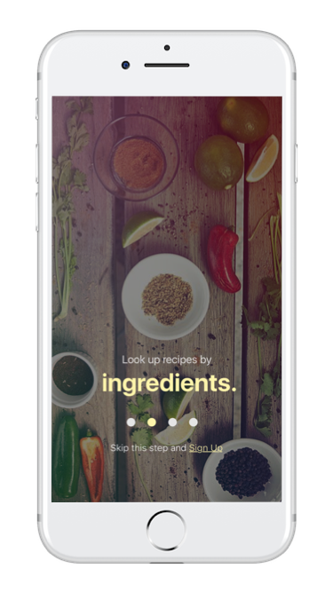
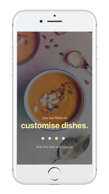
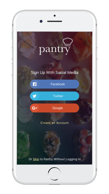
A home-cooking mobile app that generates quick and easy recipes from ingredients you have at home.
Created for marketing website
PROJECT OVERVIEW
THE PROBLEM
Cooking is part of most daily routines. Canadians spent 60 minutes a day cooking. 53% of people surveyed say that choosing what to cook is the least enjoyable part of the cooking process.
THE SOLUTION
Pantry is a recipe app that saves browsing time for people who cook at home. It removes the pain of deciding what to cook with an innovative, seamless user interface. More detailed description provided in my Design Brief.
target users
Beginner to Intermediate level home cooks and millennials that find cooking to be a difficult task.
SUCCESS meaSured by
# of downloads, frequency of usage, engagement time.
MY ROLE
As a UX/UI designer (individual project) my role was to research, design and test all UIs related to the project.
TOOLS
Invision (prototype), Sketch (hi-fi wireframes), Balsamiq (low-fidelity wireframes), Pen and Paper (storyboarding), Whiteboard, Principle (animation).
STYLE GUIDE
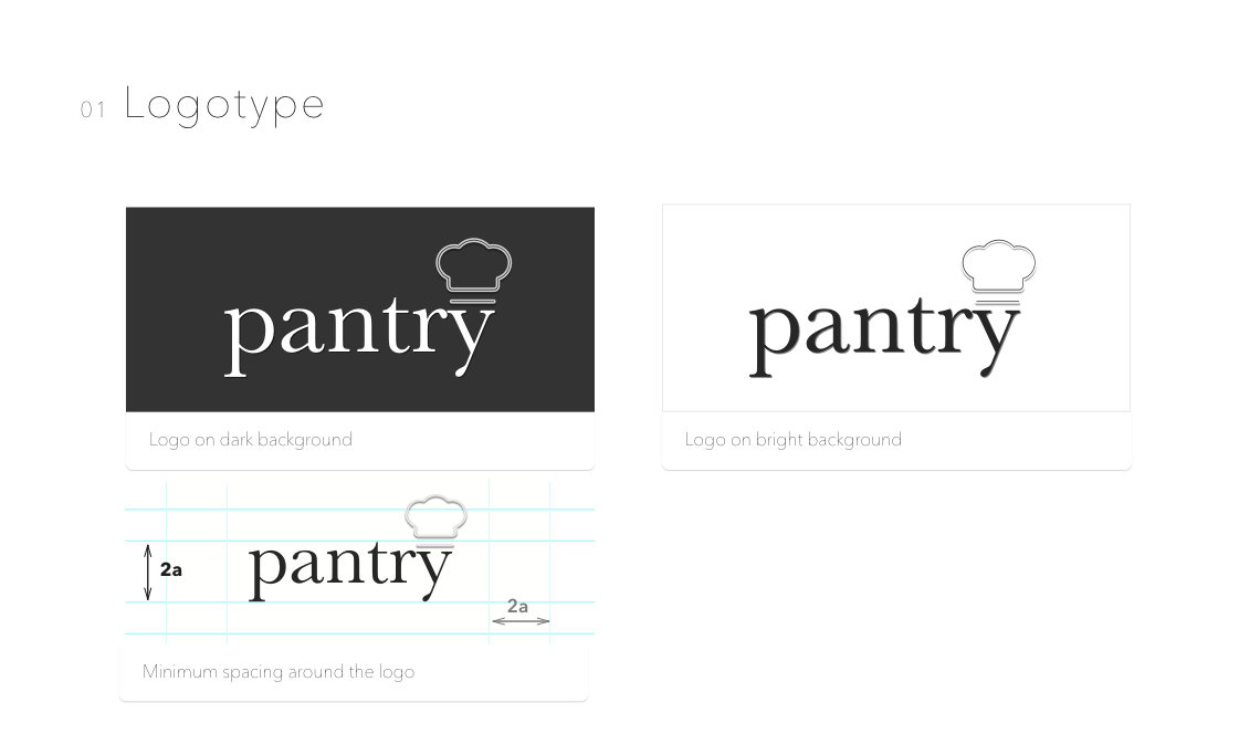
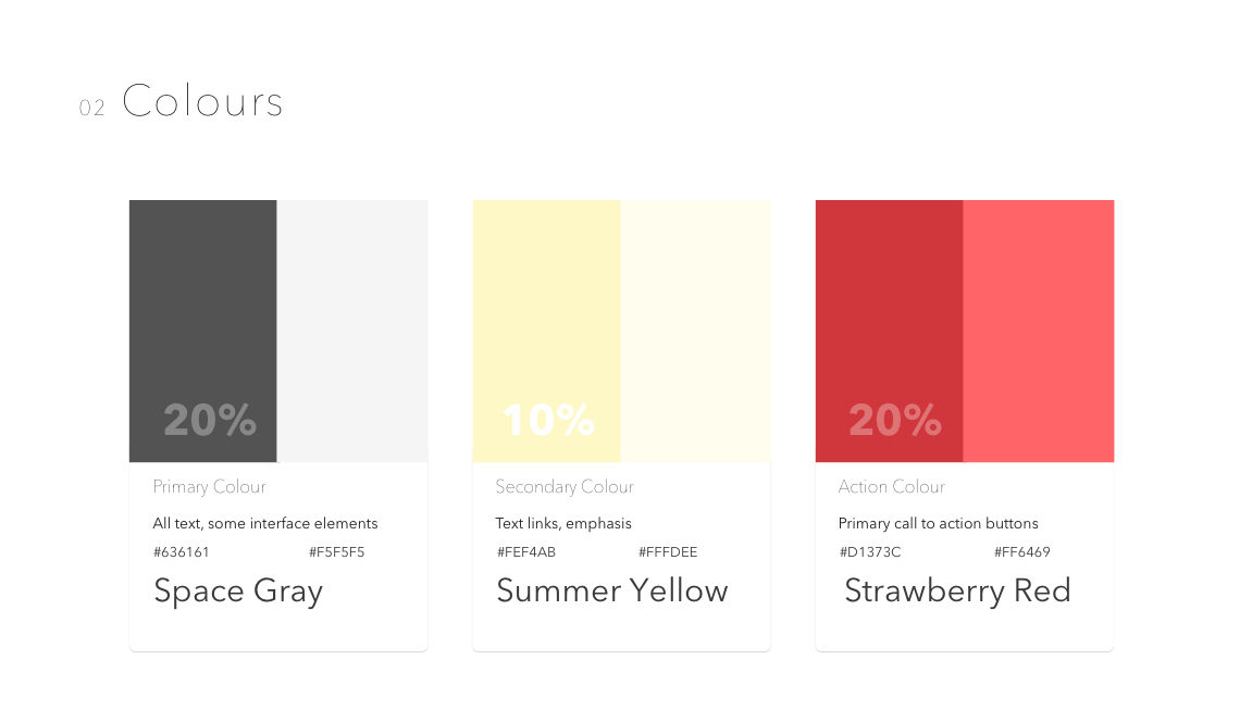
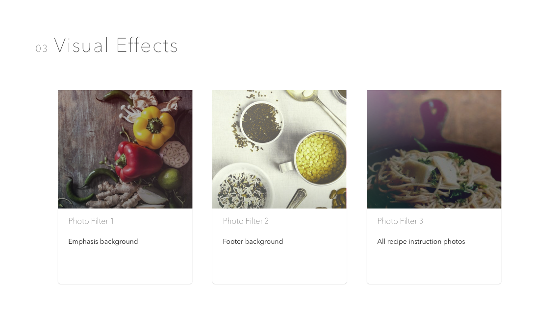
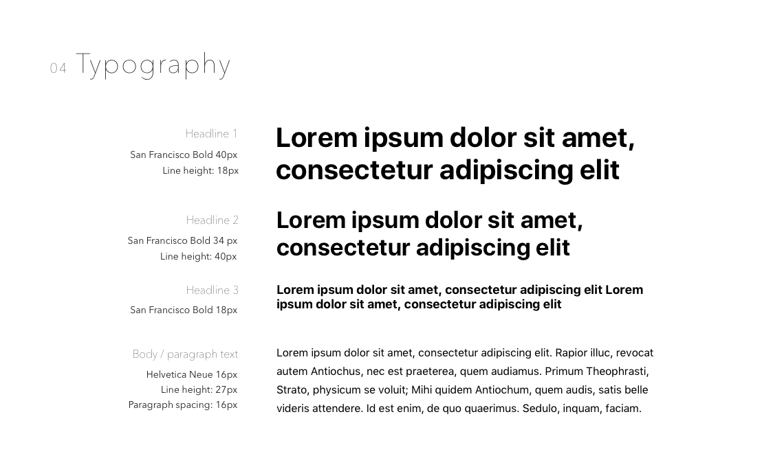
I created a simple style guide (logotype, colours, visual effects and typography) to remain consistent with the branding.
DESIGN PROCESS (AGILE)
Although all these principles were used, for the sake of simplicity I have only shown the major components.
1. RESEARCH & REQUIREMENTS
Ideation
Design brief & sprint plan
Competitive reviews
Business model canvas
User stories
User personas
2. designing & DEVELOPING
Information architecture
User flows
Wireframes
Mood boards & style tiles
Style guide & branding
On-boarding
3. TESTING & Refining
Rapid prototyping
A/B testing
Wireframes
Qualitative data
Validation
Invision demo
RESEARCH AND DISCOVERY
I spent the entire Week 1 researching the current cooking problems and trends. This gave me a deeper understanding of the pain points and a wholistic perspective to create the best solution possible.
45% OF MILLENnIAL MEN COOK
That's almost half. Young men are particularly attracted and inspired by shows like Gordon Ramsay and Facebook videos..
59% cook with a SMARTPHONE IN hand
Instead of a recipe book. Yup that's right. Recipe books are collecting dust. Smartphones are light and easy to use while multitasking.
MILLENNIALS SAY "cooking is sexy"
Pantry is walking with the trends. Since Pantry targets Millennials, I decided to make Pantry to be targeted to a gender neutral audience, but it still remains sexy and contemporary about food.
Research source Washington Post and Think with Google .
70% of women cook these days
A bump from the 67 percent that cooked two decades ago but a definite decline from the 88 percent of women who cooked 40 years ago.
60 minutes of time spent cooking
Women spend 71 minutes a day cooking and men spend 49 minutes a day cooking. This leads us to an average of 60 minutes.
cooking is becoming GENDER-LESS
Companies that make money off food are weighing how to take advantage of the trend, deciding whether to treat cooking as a distinctly masculine activity or to show foodie-ism as a gender-neutral hobby.
Research source Washington Post and Think with Google .
USER PERSONA
Based on the research found in the research period of the project a persona was developed, Jessica Chan. Designing for Jessica helped me in making informed design decisions as I had the end user always in mind.
LOW - FIDELITY WIREFRAMES
Keeping Jessica in mind, I created the low - fidelity user’s behavioural flow from ingredient discovery to recipe generation with Pantry integrated in her behavioural decision making. These flows helped in defining the necessary features required for Jessica to successfully navigate through the app.
Below is a collection of 9 screens in lo-fi. These greyscale wireframes were designed in Balsamiq.
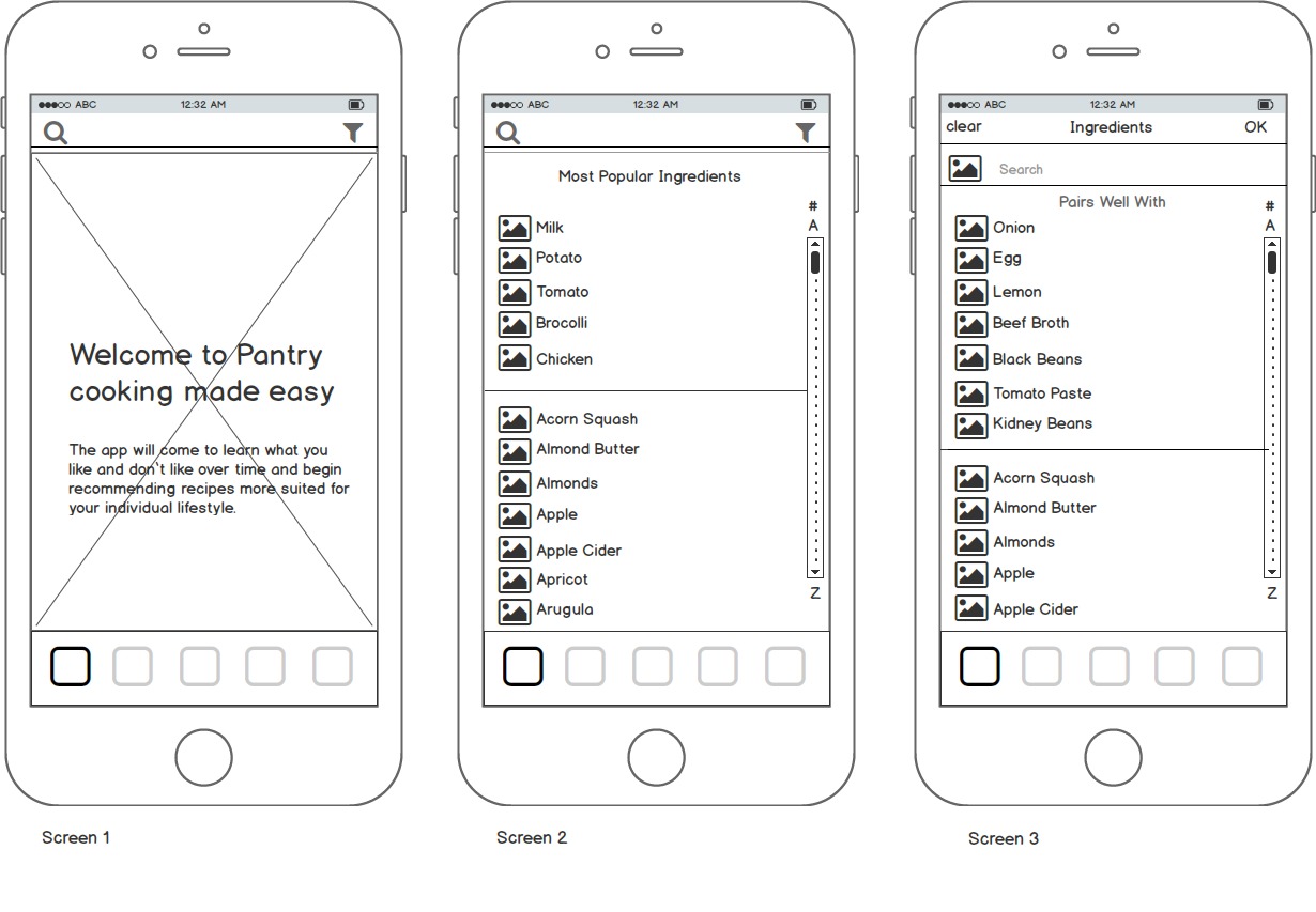
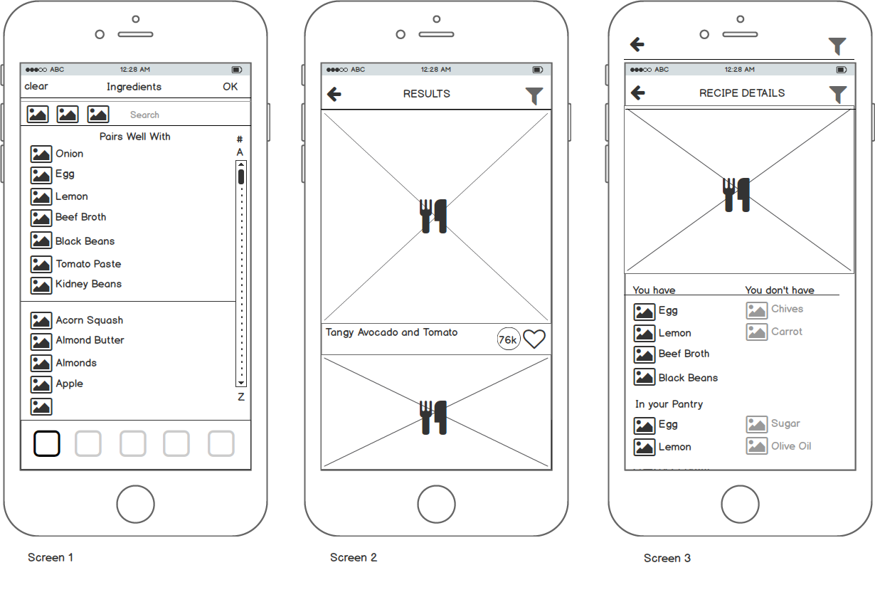
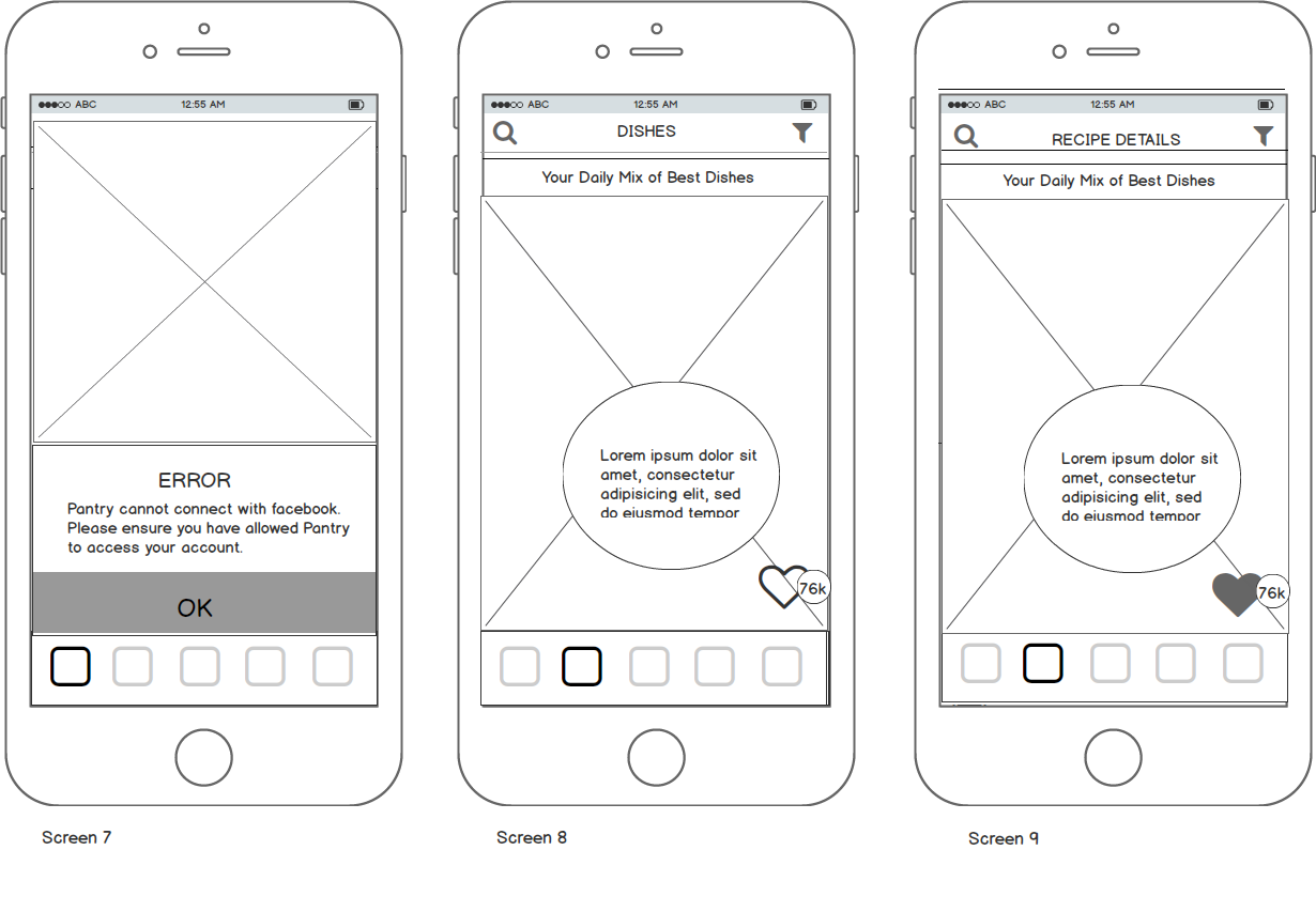
Although the low- fidelity seems quite detailed, I decided to remove unnecessary steps in my hi-fidelity to keep the journey simple.
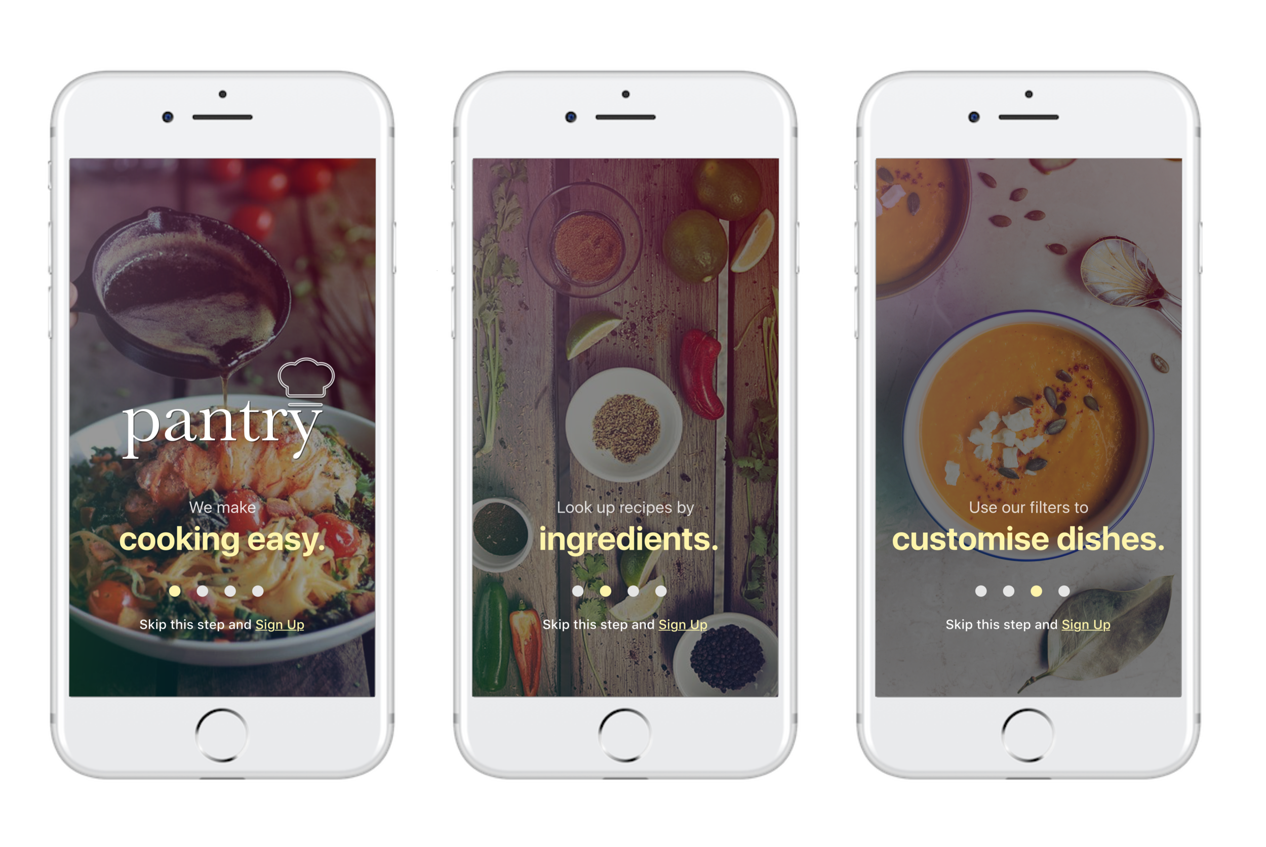
HI - FIDELITY WIREFRAMES
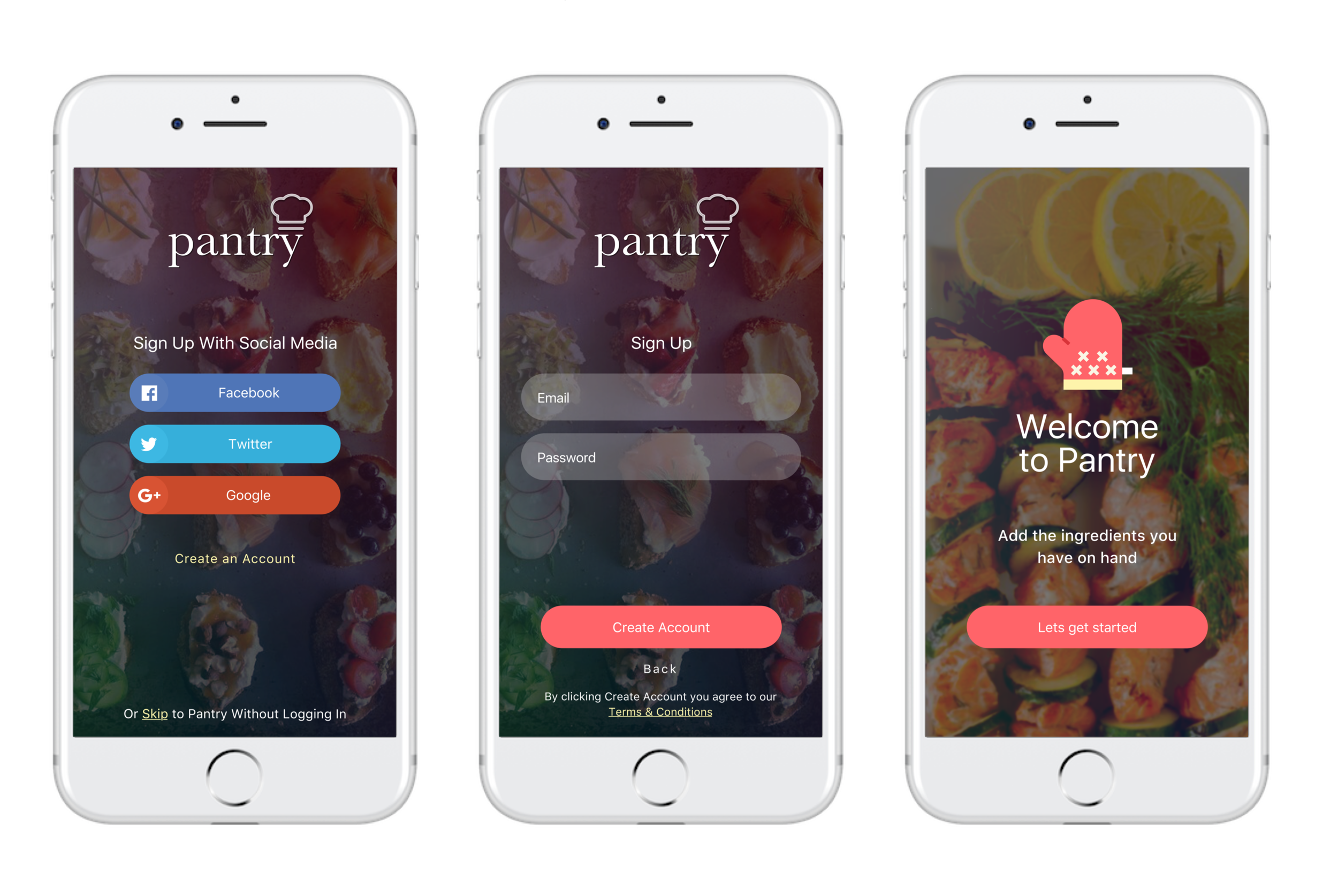
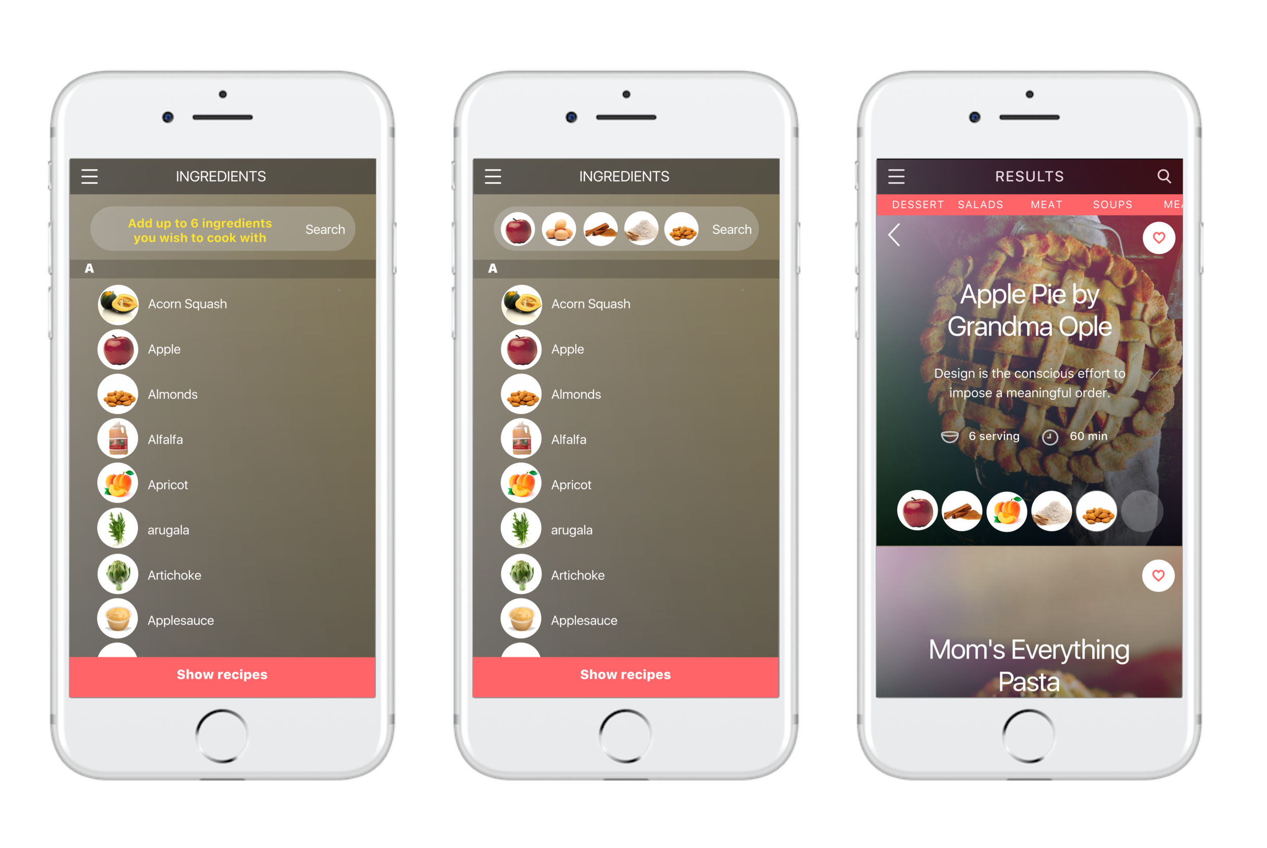
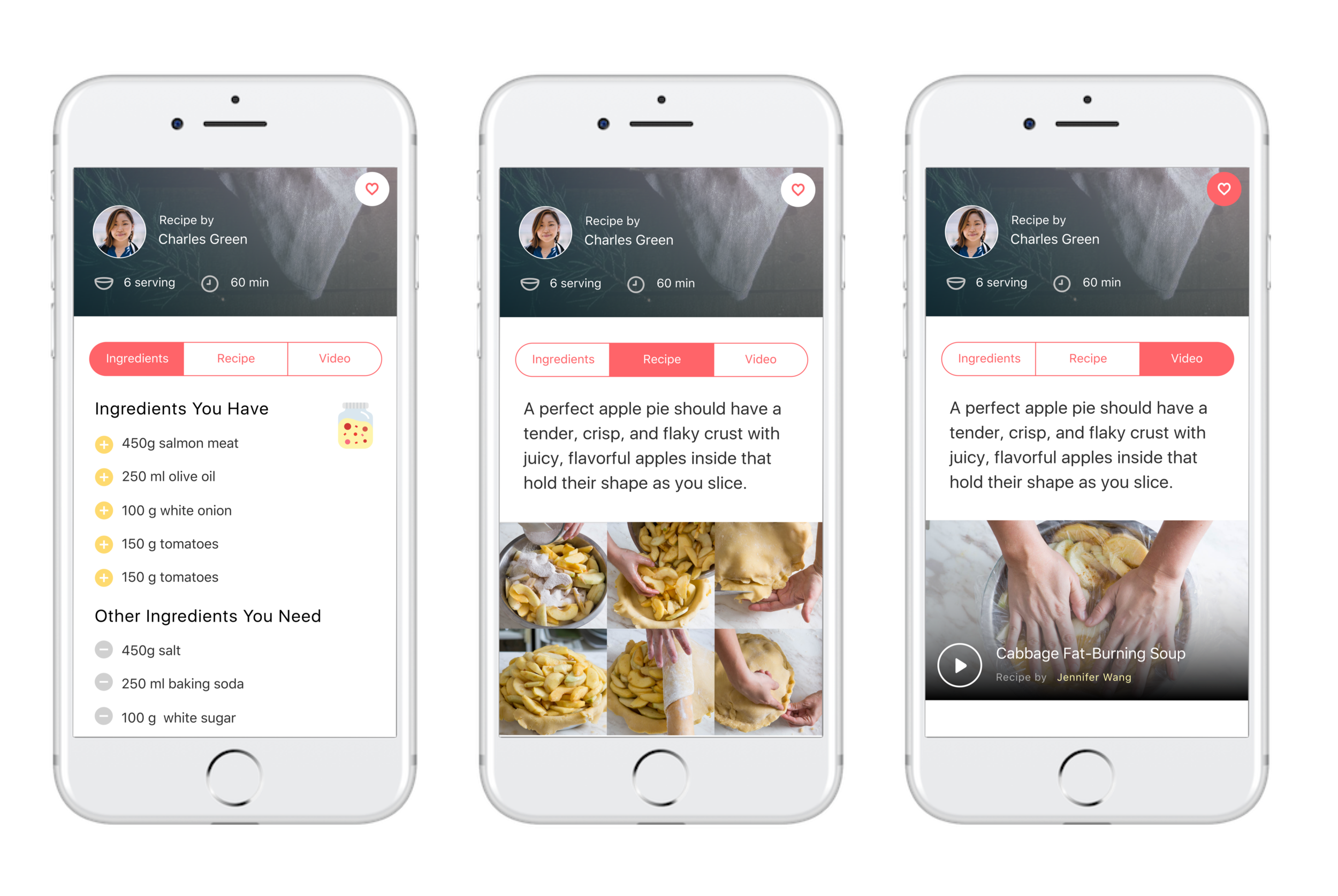
These high fidelity UI screens were created over a period of 2 full weeks. Meticulosity testing users, and redesigning with feedback received.
KEY LEARNINGS
Every UX designer needs to be a kind of detective in the early stage of a project. We need to find out as much as we can about the three Ps (people, problem, project).
User Experience is more than Usability. It is tapping also into someone’s emotional state of mind.
Although we have matured in technology, the importance of User Experience keeping keeps increasing.
PRESENTATION
Competitors, Personas, Reviews and more...
I also have a presentation deck. If you want to view it - CLICK THE LINK.
Thanks for being so curious! :)


